The lightness of the Iron
Papaiz
Ver descrição
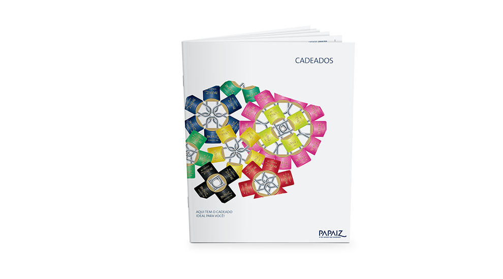
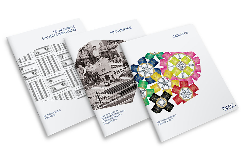
With the expansion of real estate and the growth on the search for architects and decorators services, we helped the Grupo Papaiz to reposition its printed material.
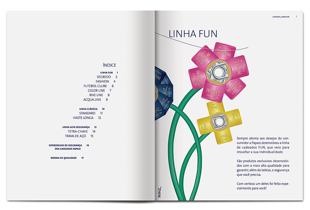
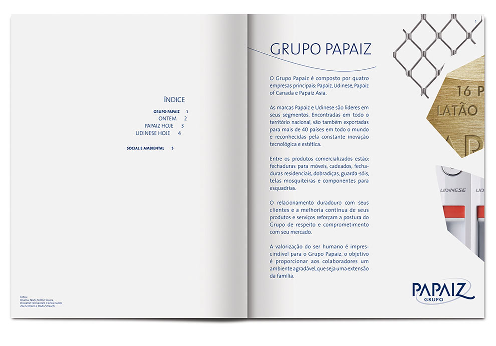
The new catalogue line received a lot of white in order to stand out at the point of sales. We also chose to create an unusual graphic language, exposing the products in a different way, using asymmetric cuts in the formation of drawings and mosaics, increasing the potential to attract the new audience.
Check out the result!


